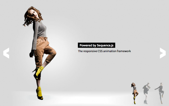
The responsive CSS animation framework
For creating sliders, presentations, banners, and other step-based applications
- 1
.seq-in .content { transform: translateY(0); transition: .2s; }Step 1
Easily add CSS transitions to step-based applications using "in" and "out" CSS classes
Step 1 is currently in its
in1position. Watch what happens when you go to the next step → - 2
.seq-out .content { transform: translateY(-100%); transition: .2s; }3.content { transform: translateY(100%); }4.seq-in .content { transform: translateY(0); transition: .25s; }Step 2
Sequence.js takes care of the functionality so you can concentrate on presenting your content in style
By going to the next step, you caused step 1 to animate from
in1toout2and step 2 to animate fromstart3toin4. All with just several of lines of CSS.When navigating backwards Sequence.js can automatically reverse these transitions.
.seq-in .rotate { animation-name: rotate; animation-duration: 1s; }.seq-in .fade { animation-name: fade; animation-duration: 1s; }.seq-in .threed { animation-name: threed; animation-duration: 1s; }Step 3
Create unique animated applications using any CSS properties you wish
Sequence.js doesn't limit you to specific HTML/CSS. Use the properties, attributes, workflow, conventions, and libraries you're familiar with.
-
Transform
-
Scale
-
Rotate
-
Fade
-
3D
& more
-
.seq-in .touch { animation-name: rotate; animation: .35s 1.8s; }.seq-in .touch-title-1 { animation-name: fade-out; animation: .3s 1.5s; }.seq-in .touch-title-2 p { animation-name: slide-in; animation: .3s 2.35s; }Build for a multi-device, modern web...
Fully responsive with touch support


- 5
.seq-in .content { transform: translateZ(0); will-change: transform; }6.seq-next { /* Makes an element a functioning next button */ }7.seq-touch { /* Styles for touch devices */ }All of the features you need for animated applications
Fully documented, along with 30+ options, and an easy-to-use API.
- Responsive Support
- Hardware Accelerated Animation5
- Touch Support
- Easy-to-add UI6
- Auto Play/Cycle
- State Classes for Easy Styling7
- Preloader
- & More
.browser-icon { transform: scale(0); transition: .2s; transition-timing-function: cubic-bezier(.55,1.58,.63,.99); }.seq-in .browser-icon { transform: scale(1); }8.seq-fallback { /* Fallback specific styles */ }Supported in modern browsers
-

Firefox
-

Opera
-

Safari
-

Chrome
-

Edge/
IE10+
With a fallback theme for legacy browsers
A traditional side-to-side slider is automatically shown when a browser doesn't support CSS transitions and transforms. Use the
.seq-fallbackclass to style Sequence.js in older browsers8.-

IE9
-

IE8
-
/* Install via NPM */ npm install sequencejs/* Install via Bower */ bower install sequencejsThis presentation was powered by
Make your animated step-based application today...
View Example Themes Download Now
Features
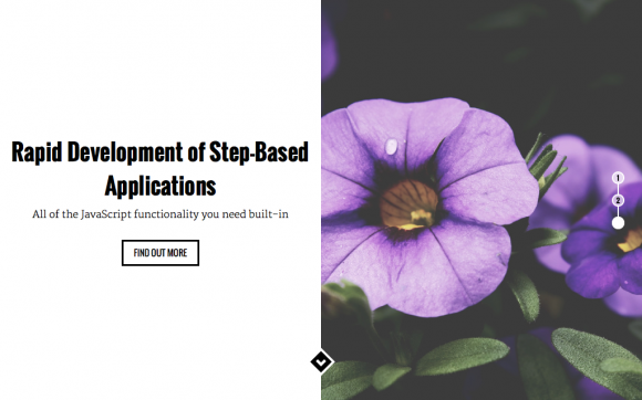
Rapid development of step-based animated applications
All of the JavaScript functionality you need built-in, so you can concentrate on substance and style

CSS Animation Framework
State-based CSS class names allow you to quickly create unique transitions between the steps of your application. There's no limited set of in-built styles to choose from, you get creative control. Apply the styles you wish and make your elements move, shrink, grow, rotate, fade and more, in 2D and 3D space!

Responsive & Smooth
Use media queries and your favourite CSS features to make responsive applications for desktop, tablet, mobile, and other devices. This comes with the benefit of hardware acceleration and the potential to reach a silky smooth 60 frames per second, even on mobile devices.

Touch Support
With smooth transitions and support for responsive layouts, a native-app feel is achieved with blazingly fast touch support powered by Hammer.js.

Cross Browser
Tested in major desktop, tablet, and mobile browsers and fully featured in Firefox, Chrome, Safari, Opera, and Internet Explorer 10+. With support for Internet Explorer 8 & 9 via a fallback theme; a traditional side-to-side slider.

30+ Options & API
Over 30 options allow for complete control over how your application behaves. Customizable features include autoplay, preloader, touch support, hashtags, custom key events, callbacks, and more. All carefully documented for ease of use. View Documentation →

Ready-Made Themes
Quickly add one of our ready-made Sequence.js themes to your web page and easily modify using just HTML and CSS. Visit the Theme Store for a growing collection of stylish Sequence.js themes.
Theme Store
Ready-made Sequence.js themes
Responsive and tested in modern browsers and Internet Explorer 8+